
Matplotlib
northboat 7/11/2022 PythonDataScience
数据可视化
Matplotlib 基础
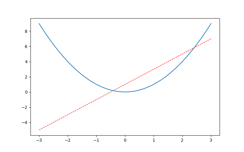
Figure 画布
import matplotlib.pyplot as plt
import numpy as np


x = np.linspace(-3,3,50)
y1 = 2*x+1
y2 = x**2
# 设置图片名称figure3,大小为(8,5)
# 要先设置画布,才能plot(布局)
plt.figure(num=4, figsize=(8, 5))
# 设置曲线颜色、宽度、线段类型(虚线,默认实线)
plt.plot(x, y1, color='red', linewidth=1.0, linestyle='--')
plt.plot(x, y2)
# 展示图片
plt.show()
1
2
3
4
5
6
7
8
9
10
11
12
13
14
15
2
3
4
5
6
7
8
9
10
11
12
13
14
15
np.linspace从start和end之间均分为n个元素组成一个向量- 先设置画布
figure,再布局plot,最后展示show
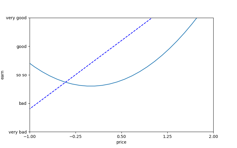
Spines 坐标轴
plt.figure(num=6, figsize=(8,5))
plt.plot(x, y2)
plt.plot(x, y1, color='blue', linewidth=1.5, linestyle='--')

plt.xlim(-1,2)
plt.ylim(-2,3)

plt.xlabel('price')
plt.ylabel('earn')

x_ticks = np.linspace(-1,2,5)
print(x_ticks)
plt.yticks(np.linspace(-2,3,5),
           ['very bad','bad','so so','good','very good'])
plt.xticks(x_ticks)
plt.show()
1
2
3
4
5
6
7
8
9
10
11
12
13
14
15
16
2
3
4
5
6
7
8
9
10
11
12
13
14
15
16
xlim/ylim限制坐标范围xlabel/ylabel定义坐标意义xticks/yticks定义坐标轴刻度,两种重载,可以给某个坐标定义特殊含义,传入两个向量,第一个向量为坐标,第二个为其含义,一一对应
如上图,整个图的框架是四条线段,若想呈现以下效果,则只保留x/y轴,并设置原点
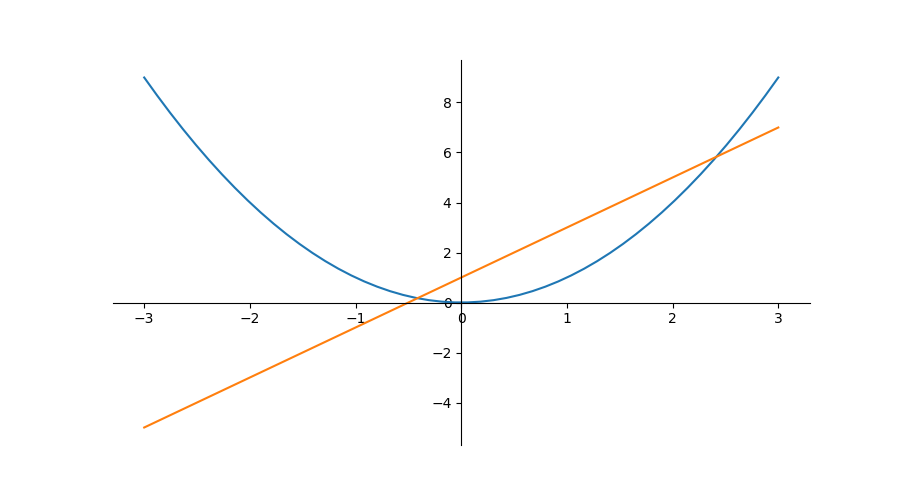
首先去掉右,上两条框架,即设置其颜色为none
plt.figure(num=7, figsize=(9,5))
plt.plot(x, y2)
plt.plot(x, y1)

ax = plt.gca()
ax.spines['top'].set_color('none')
ax.spines['right'].set_color('none')
1
2
3
4
5
6
7
2
3
4
5
6
7
gca即get current axis,获取当前轴- 改变轴信息修改
ax属性即可 spines即为包含四条骨架的数组
设置x/y轴
ax.xaxis.set_ticks_position('bottom')
ax.yaxis.set_ticks_position('left')
1
2
2
- 即将
下骨架作为x轴,左骨架作为y轴
设置原点并展示
ax.spines['bottom'].set_position(('data',0))
ax.spines['left'].set_position(('data',0))
plt.show()
1
2
3
2
3
- 这里的
data是固定的,即表示数据值为0的点作为bottom(x轴)零点
Legend 图例
通过legend函数给曲线添加图例,用l1 ,= plt.plot()的方式获取曲线编号
plt.figure(num=7, figsize=(9,5))
ax = plt.gca()
ax.spines['top'].set_color('none')
ax.spines['right'].set_color('none')
ax.xaxis.set_ticks_position('bottom')
ax.yaxis.set_ticks_position('left')
ax.spines['bottom'].set_position(('data',0))
ax.spines['left'].set_position(('data',0))

# ,=表示取出可迭代对象中的唯一元素(即作用于只含有一个元素的迭代器)
l1 ,= plt.plot(x, y1, color='blue', linestyle='--', linewidth=1.0)
l2 ,= plt.plot(x, y2, color='red')
plt.legend(handles=[l1, l2], loc='lower right', labels=['Straight', 'Curve'])

plt.show()
1
2
3
4
5
6
7
8
9
10
11
12
13
14
15
2
3
4
5
6
7
8
9
10
11
12
13
14
15
handles=[]用以绑定曲线编号,编号由plt.plot()函数返回,用,=的形式进行取值(取出迭代器中的唯一元素)loc=''设置图例位置,有以下位置选择best upper right upper left lower left lower right right center left center right lower center upper center center1
2
3
4
5
6
7
8
9
10
11labels=[]用以绑定handles向量中的值,按顺序赋值
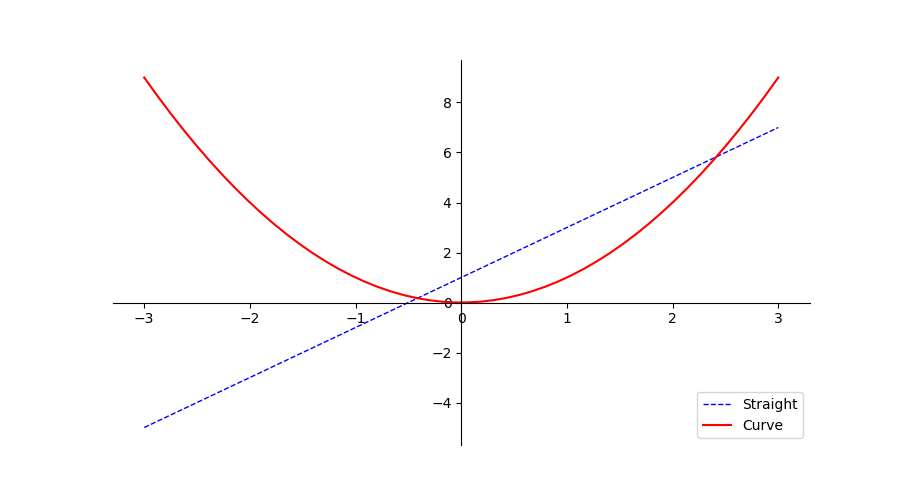
- 右下角即为图例
Annoloctation 标注
# 设置画布和坐标轴
plt.figure(num=8, figsize=(9,5))
ax = plt.gca()
ax.spines['top'].set_color('none')
ax.spines['right'].set_color('none')
ax.xaxis.set_ticks_position('bottom')
ax.yaxis.set_ticks_position('left')
ax.spines['bottom'].set_position(('data',0))
ax.spines['left'].set_position(('data',0))

# 直线
x = np.linspace(-3,3,50)
y1 = 2*x+1
y2 = x**2
# 点
x0 = 1
y0 = 2*x0+1
# 绘制散点图,若为单个点,即为描点
plt.scatter(x0,y0,s=40,color='b')
plt.scatter(x, y1, s=5, color='r')
# 绘制虚线,连接两点(x0,0)和(x0,y0),一条垂直于x轴的线段
plt.plot([x0,x0],[0,y0], ls='--',lw=2.5, c='r')
plt.show()
1
2
3
4
5
6
7
8
9
10
11
12
13
14
15
16
17
18
19
20
21
22
23
2
3
4
5
6
7
8
9
10
11
12
13
14
15
16
17
18
19
20
21
22
23
s设置点的大小lw即为linewidthc即为color,b为blue简写,r为red简写

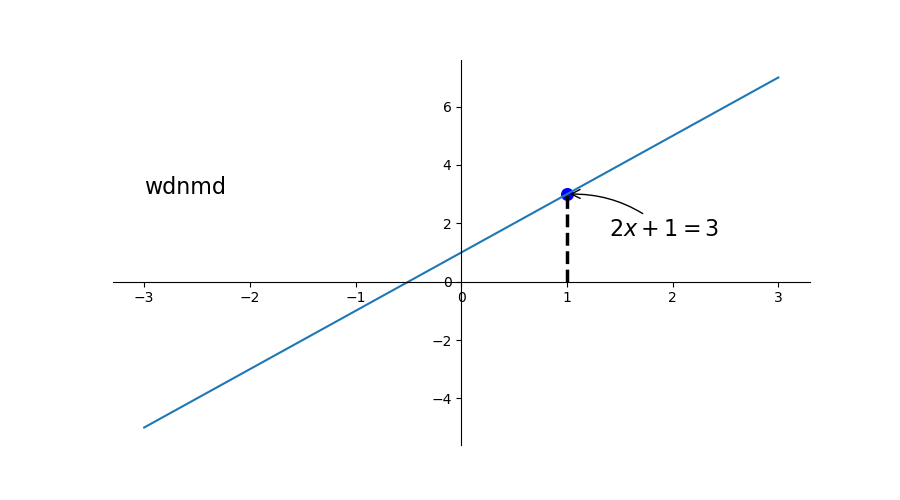
添加注释和文字
x = np.linspace(-3,3,50)
y1 = 2*x+1
x0 = 1
y0 = 2*x0+1
# 描点
plt.scatter(x0,y0, s=70, color='b')
# 画线
plt.plot(x, y1)
# 画虚线,标注点
plt.plot([x0,x0],[0,y0], ls='--',lw=2.5, c='black')
# 对点(x0,y0)添加注释
plt.annotate(r'$2x+1=%s$'%y0,xy=(x0,y0),xycoords='data',xytext=(+30,-30),textcoords='offset points',fontsize=16,arrowprops=dict(arrowstyle='->',connectionstyle='arc3,rad=.2'))
# 在`data`值为(-3,3)处添加文字
plt.text(-3,3,'wdnmd',fontdict={'size':'16', 'color':'black'})
plt.show()
1
2
3
4
5
6
7
8
9
10
11
12
13
14
15
2
3
4
5
6
7
8
9
10
11
12
13
14
15
annotate第一个参数为注释内容(字符串);xy=()为标注点的坐标;xycoords设置坐标的含义,如此处为数据值data的坐标;fontsize设置字体大小,接收浮点型数据 ;arrowprops接收一个字典,设置箭头的样式,连接方式text函数添加文字,第一、二个参数为文字坐标(左下角坐标);第三个参数为文字内容(字符串);fontdict接收一个字典,用于设置字的样式、大小等
Tick 能见度
调整被曲线遮挡的坐标lebal的可见度和颜色
x = np.linspace(-3,3,50)
y = 0.1*x

# 设置画布、坐标、绘图
plt.figure()
# 设置y轴上下限
plt.ylim(-2,2)
ax = plt.gca() # 获取骨架
# 删去上、右骨架
ax.spines['right'].set_color('none')
ax.spines['top'].set_color('none')
# 设置坐标轴
ax.xaxis.set_ticks_position('bottom')
ax.yaxis.set_ticks_position('left')
# 设置原点
ax.spines['bottom'].set_position(('data',0))
ax.spines['left'].set_position(('data',0))

plt.plot(x, y, lw=10, zorder=1)

# 对被遮挡的图像调节相关透明度,本例中设置 x轴 和 y轴 的刻度数字进行透明度设置
for label in ax.get_xticklabels()+ax.get_yticklabels():
    label.set_fontsize(12)
    '''
    其中label.set_fontsize(12)重新调节字体大小,bbox设置目的内容的透明度相关参,
    facecolor调节 box 前景色,edgecolor 设置边框, 本处设置边框为无,alpha设置透明度.
    '''
    # 其中label.set_fontsize(12)重新调节字体大小,bbox设置目的内容的透明度相关参,
#     facecolor调节 box 前景色,edgecolor 设置边框, 本处设置边框为无,alpha设置透明度.
    label.set_bbox(dict(facecolor='white',edgecolor='none',alpha=0.7))

plt.show()
1
2
3
4
5
6
7
8
9
10
11
12
13
14
15
16
17
18
19
20
21
22
23
24
25
26
27
28
29
30
31
32
2
3
4
5
6
7
8
9
10
11
12
13
14
15
16
17
18
19
20
21
22
23
24
25
26
27
28
29
30
31
32
调整前
调整后
Seaborn
对 matplotlib 的进一步封装